Friday 29 April 2011

Sketches of floral background

Inspired by the floral graphics I did some experimenting sketches on my pad in order to get further inspirations.


Friday 22 April 2011

Paper butterfly design

I deciede to use paper butterfly again in my secong illustration. Inspired by the images of butterflies with broken wings,instead of being negative, I came up with a new idea which is to repair their broken wings in order to represent the message of " self-recovery " and " be positive ".
I started experimenting with paper again as I want to use paper butterflies in both two illustrations. Similar to the first paper butterfly design, I drew the figure on paper and cut it out, pasting its body and wings together by using double-side tap. After that I tore its left wing in pieces and mend them back by sewing.  There are many ways of repairing the broken wings, the reason I chose sewing is people can imagine the pain when they look at the pinholes, and it helps to show that the character (butterfly) is hard struggle to recover and fly back to the sky. I am satisfied with the effect when it came out and I think it is very appropriate for the title of the song “Let’s start from here”.


Monday 18 April 2011

Sketches of butterflies with broken wings


Inspired by the butterfly images I did some sketches of butterflies with broken wings in order to look at their shapes and get further inspiration.

Butterflies with broken wings

I looked back to the first illustration I have done and I was thinking why not use the same elements in both two designs to make them in a similar style? Therefore I started to think of ideas about butterflies and flowers with the design concept of mixed media.
These are some images of butterflies with broken wings which are similar to the images of angels I saw before. But instead of being negative, I came up with a new idea which is to repair their broken wings in order to represent the message of " self-recovery " and " be positive


http://193.105.21.101/image?id=16592&hsearch=ugly+insect&hmenu=bv

Saturday 16 April 2011

Sketches of angels with broken wings

Inspired by the relevant images I found online, I did some sketches of angels with broken wings to get further inspirations.
I felt something is missing when I looked back to these sketches I have done. Bleeding, injury, pretty, all I can see are negative elements. But the most important message the song gives me is not give up and be brave. I think I need to come up with something cured and positive to make sure my illustration shows the correct message of the song.


Inspirations: Angels with broken wings

There were some images appeared in my mind when listening to the song, including bleeding injury,broken hearts, flying wings,scratch lines,end points and so on...Regarding to the lyrics "We are beautiful, but got lost", I was thinking to design a nice looking character but with defects. Based on this idea, the first thing came up in my mind is a pretty angel with broken wings.

I found these images online and they are really inspiring to me. It seems very sad that beautiful angels cannot fly with their broken wings. I think this idea is closed to the meaning of the song so that I did some sketches of angel with broken wings in order to get further inspirations.


http://legacythumbs.weheartit.netdna-cdn.com/20081005195003.jpg

http://www.friendsorenemies.com/profiles/blog/list?user=2lap1v4j8p5x6

Friday 15 April 2011

The second song I have chose-Let's strat from here

Giving up, why should I
I've come too far to forget
We're beautiful, we just got lost
Somewhere along the way
So much was missing when you went away

Let's start from here, lose the past
Change our minds, we don′t need a finish line
Let's take this chance don’t think too deep
Of all those promises we couldn′t seem to keep
I don't care where we go
Let's start from here

Standing here face to face
A finger on your lips
Don't say a word don't make a sound
Silence surrounds us now
Even when you were gone I felt you everywhere
Let' start from here, lose the past
Change our minds, we don′t need a finish line
Let's take this chance don’t think too deep
Of all those promises we couldn′t seem to keep
I don't care where we go
Let's start from here

I've never been the one to open up
But you've always been the voive within
The only warmth from my cold heart
Let's start from here, lose the past
Change our minds, we don't need a finish line
Let's take this chance don’t think too deep
Of all those promises
Let's start from here, lose the past
Change our minds, we don't need a finish line
Let's take this chance don’t think too deep
Of all those promises we couldn't seem to keep
I don't care where we go
Let's start from here

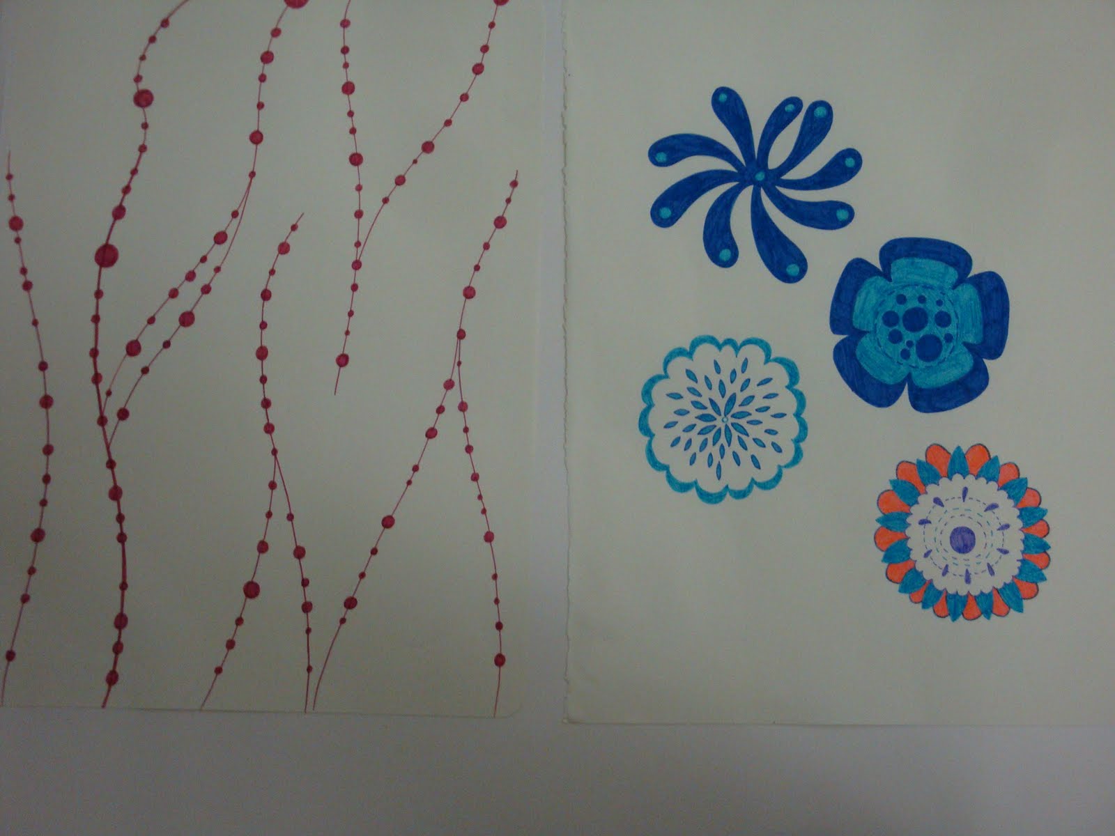
I would say this is the most awsome touching song I have ever heard.The melody is very smooth and beautiful, reminds me of some very nice time I spent in a sunny afternoon alone. However, I found a bit sentimental when I read the lyrics carefully. I can see a broken-hearted girl who is talking to herself, lopping her bleeding wounds and trying to strat a new life. I would say "injured" and "recover" atr the main theme of this song.I will start to do some research based on these two keywords to get some inspirations.

image: http://www.google.co.uk/imgres?imgurl=http://www.lifeofguangzhou.com/node_10/node_35/node_112/node_115/img/2008/04/09/120770974136819_2.jpg&imgrefurl=http://www.lifeofguangzhou.com/node_10/node_35/node_112/node_115/2008/04/09/120770974136819.shtml&usg=__r21uWVFnfiPKdvt_kY2vB1vwWyQ=&h=536&w=500&sz=126&hl=en&start=82&zoom=1&itbs=1&tbnid=KgkIP1H3Dnl8uM:&tbnh=132&tbnw=123&prev=/search%3Fq%3Djoanna%2Bwang%26start%3D80%26tbnid%3Doc57Tmcm8DxMmM:%26tbnh%3D0%26tbnw%3D0%26hl%3Den%26sa%3DN%26ndsp%3D20%26biw%3D1259%26bih%3D850%26tbm%3Disch&ei=XSHJTaG4FYuo8QOm1ZA6

Tuesday 12 April 2011

My first illustration design


I designed the final layout of illustration which is a smiley shy girl hiding behind a pillar, waiting for her boy,there are some butterflies floating over her head, as the imagery of her sincere love and lovely mood,which I think can match the song perfectly. 

Sunday 10 April 2011

Background design


For the background design I decided to use my own photograph of flowers and add digital effect in software. As I mentioned early in this project, I'd like to use blossoms and butterflies to create romantic and floating feelings. I selected one of my floral images and adjusted its color in Photoshop. I turned the image into warm yellow to create a sunshine effect.

Paper butterfly design


Inspired by Villinsky's butterfly art work and other mixed media illustrations,I decided to design a butterfly character for my illustration by using paper. Firstly I drew the outline of a butterfly and then cut its body and wings out, folded it and pasted them together to produce a 3D effect. After that I photographed it and changed it in to pink in Photoshop.

Friday 8 April 2011

Girl character design 2


These are my second girl character design. I did a sketch first and I scanned in my PC, re-colored it and fixed the details in Photoshop. I am very happy that I came up with this design, it seems that the girl is smiling and thinking of something, or someone. The design gives me a romantic feeling and I think it really fits the title of the song- Lost in Paradise.

Tuesday 5 April 2011

Girl character design


I did some rough drawings of girls on my pad and I selected one of them to work on in Photoshop as experiment. I don't know what exactly the character I want to come up with, but I am likely to design a smiling and lovely girl as the main character for the illustration. I don't think I will use the design above in my final, instead I am trying to design a girl character with clear expressions then the audience can feel the atmosphere by looking at her.

Friday 1 April 2011

Background design experiments

I have done some rough drawings with watercolour and wax for the background design experimenting. The reason I chose to play with these two materials is they can't be mixed with each other. The process was atually quite enjoyable as I can put colours on the top with big brushes and don not need to avoid the white space,which are coverd by wax. However I wasn't happy when the effect came out as the dry wax drop off the paper easily, I think there's a better way to do this which is using masking-fuid-liquid.

I made these two blured background with oil pastels, I drew a lot of dots at first and then blur them into each other by my fingers. I really like this adorable effect as if there are many confluence which are shrouded in mist.